Range Cooker Manuals - The Good, Bad and Ugly
12/12/13 15:22 Filed in: Help & Advice
A range cooker is something of an investment for most people, and represents a considerable spend from the family coffers. Once you have your range, getting to grips with how it functions is clearly an important stage, and although this may be intuitive for some people there are times when your cooker’s user guide or instruction manual becomes a useful resource - not least when it comes to installation. The quality of this document is variable, and there are certainly some improvements to be made in certain cases. Here we take a look at some examples...
The most popular range cooker brand in the UK, Rangemaster have raised their game in recent years when it comes to their User Guides. The same format is used for Aga Rangemaster’s Falcon and Mercury brands.

Rangemaster use an A4 format, with a semi-gloss card cover printed in colour, with food and cookware photos and even a couple of recipes. A small silver sticker bearing the model name and serial number is stuck in the middle of the front cover in a slightly ad-hoc way, but is there should you need it to fill in the blue panel on the inside rear cover with further product and purchase details needed for any service issues. On this page there is also clear information about spares/service and warranty. The adjacent page clearly shows is tabulated form all the technical, dimensional and energy data for your cooker. The User Guide content is printed on fairly ordinary-feeling photocopier type paper, but to a high quality, with clear black text and excellent, box-bounded diagrams where needed, with numeric references picked out in bold within the economically used text. The two-column layout (one text, one diagrams) is simple and very easy to follow, and there is a clear index on page 1. Sometimes user guides are written by technical writers with a particular rather awkward style and an engineer’s grasp of the subject, but Rangemaster’s manual looks like it has been written by someone who understands the product from a user’s point of view, and the style is quite natural, with sensible use of typographic structure, bullet points, lists and tables which really help to navigate the content, which is informative in a step-by-step way and not too wordy. Installation information is again very clear and comprehensive, with plenty of good diagrams, and there is also extensive information on cooking times and cleaning. The model-specific diagrams and data are an impressive and costly accomplishment by the market leader, but the benefits are clear to see.
Quality/feel - 8
Content Structure - 10
Ease of Reading - 10
Diagrams - 10
Friendliness - 9
A direct competitor for Rangemaster with a great product range, Stoves rather let the side down currently when it comes to User Guides.

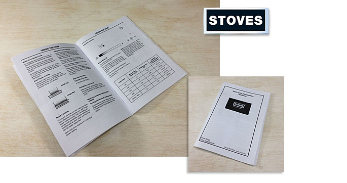
This is an area which seems to have been neglected by GDHA, the manufacturer of Stoves, Belling and New World ranges, although we understand that they are currently working on new versions. The current guides are very much of the old school - an A5 pamphlet printed on standard paper. This smaller two column format immediately seems more crowded and harder to navigate, not helped by the lack of a page index at the front. The cover is printed on the same paper as the content, and on the rear side there is an area to enter your product numbers and service records. Inside, there is a disappointing lack of clarity or professionalism. The quality and reproduction of the diagrams is poor, and these and the general composition of the document looks like they have been done by an engineer rather than anyone with a modicum of design flair. The same applies to the information in tables, which look like they are straight out of an Excel sheet. This lack of structure and the crowded, typographically unimaginative text combined with the rather austere writing style all add up to a document you want to put straight back in the drawer rather than engage with, unlike the better examples we have seen which have a more step-by-step approach. Much information is hard to find or actually missing - for example, if you need to know how to level your cooker on installation, you will find that there is no reference to how to do this. All a bit dire, really.
Quality/feel - 4
Content Structure - 4
Ease of Reading - 4
Diagrams - 4
Friendliness - 4
A prestige brand known for the quality of their marketing materials, it is no surprise that Britannia have been able to put rather more effort than most into their instruction manual...

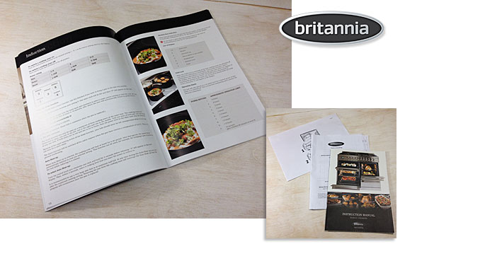
However, they have decided to produce the installation and commissioning instructions as a separate document for the engineer, and this is very different to the Instruction Manual, taking the form of a simple, crudely printed A4 pamphlet very much of the old school, accompanied by a couple of separate sheets on how to fit telescopic shelves or oven liners. All a bit scrappy, but if the consumer can politely ignore this they can enjoy an A4 Instruction Manual printed in full colour on nice paper throughout, with a silk-sheen card cover. Britannia have taken a sensible one-size-fits-all approach, with a single manual covering all models. On the inside front cover there has been stuck a large silver data label with all your cooker’s details should you need them, and there is a clear page index on the opposite page. The content itself is generally well laid-out if not quite elegant, and there is liberal use of product detail and cooking photography relating to the subject. The smallish serif-style font used is not necessarily the best choice, not helped by being printed in a medium grey, and Britannia’s keenness to be informative has led to the content itself looking perhaps a little too wordy. This is exaggerated by the page margins being too narrow, so there is an edge-to-edge feel which makes the page look rather crowded. Also, diagrams are used only moderately, and these are very simple and perhaps a little lightly rendered. Britannia have included 8 pages of recipes after their Oven Temperature Guide section, and this does introduce some warmth and interest to what is already a well intentioned although not fully satisfying manual. It also is the only one we have seen with a price printed on the back - £9.95, so don’t lose your free one!
Quality/feel - 8 (installation guide poor)
Content Structure - 8
Ease of Reading - 8
Diagrams - 6
Friendliness - 9
Lacanche is definitely a brand which does things differently, and their idiosyncratically French approach certainly extends to their product manual.

Their spiral-bound model-specific A4 booklet is characteristically rather quaint but comprehensive, crudely printed on standard paper but with glossy card front and rear covers very reminiscent of an engineering report. A global brand, Lacanche presumably commission translations from their original French versions, and there is the occasional residual evidence of this with sections perplexingly titled “Sitting” or “Reparities”. The main content is actually well-written and clear, if a little dry, and is split into a lengthy Installation section followed by the User Guide and a multi-lingual Appendix section with tables of technical data. There is a good index on the first page. The single-column page layout is rather erratically structured, broken up by clear and very practical photographs and diagrams in the Installation section which will be a great help to an engineer. In the User Manual section the rather no-nonsense style does not change, and the slightly uninspiring, home-spun paragraph headings and typography look like they were done a long time a go on a word processor without the involvement of a graphic designer. This does make the information harder to navigate, but it is all there to find. Diagrams are crude but clear. Lacanche ranges are all about performance and integrity, and the user experience is focused on the practical rather than superficial, and this definitely comes across in the product manual.
Quality/feel - 5
Content Structure - 6
Ease of Reading - 7
Diagrams - 6
Friendliness - 5
 to browse ALL range cookers
Rangemaster
The most popular range cooker brand in the UK, Rangemaster have raised their game in recent years when it comes to their User Guides. The same format is used for Aga Rangemaster’s Falcon and Mercury brands.

Rangemaster use an A4 format, with a semi-gloss card cover printed in colour, with food and cookware photos and even a couple of recipes. A small silver sticker bearing the model name and serial number is stuck in the middle of the front cover in a slightly ad-hoc way, but is there should you need it to fill in the blue panel on the inside rear cover with further product and purchase details needed for any service issues. On this page there is also clear information about spares/service and warranty. The adjacent page clearly shows is tabulated form all the technical, dimensional and energy data for your cooker. The User Guide content is printed on fairly ordinary-feeling photocopier type paper, but to a high quality, with clear black text and excellent, box-bounded diagrams where needed, with numeric references picked out in bold within the economically used text. The two-column layout (one text, one diagrams) is simple and very easy to follow, and there is a clear index on page 1. Sometimes user guides are written by technical writers with a particular rather awkward style and an engineer’s grasp of the subject, but Rangemaster’s manual looks like it has been written by someone who understands the product from a user’s point of view, and the style is quite natural, with sensible use of typographic structure, bullet points, lists and tables which really help to navigate the content, which is informative in a step-by-step way and not too wordy. Installation information is again very clear and comprehensive, with plenty of good diagrams, and there is also extensive information on cooking times and cleaning. The model-specific diagrams and data are an impressive and costly accomplishment by the market leader, but the benefits are clear to see.
Quality/feel - 8
Content Structure - 10
Ease of Reading - 10
Diagrams - 10
Friendliness - 9
TOTAL: 47/50
Stoves
A direct competitor for Rangemaster with a great product range, Stoves rather let the side down currently when it comes to User Guides.

This is an area which seems to have been neglected by GDHA, the manufacturer of Stoves, Belling and New World ranges, although we understand that they are currently working on new versions. The current guides are very much of the old school - an A5 pamphlet printed on standard paper. This smaller two column format immediately seems more crowded and harder to navigate, not helped by the lack of a page index at the front. The cover is printed on the same paper as the content, and on the rear side there is an area to enter your product numbers and service records. Inside, there is a disappointing lack of clarity or professionalism. The quality and reproduction of the diagrams is poor, and these and the general composition of the document looks like they have been done by an engineer rather than anyone with a modicum of design flair. The same applies to the information in tables, which look like they are straight out of an Excel sheet. This lack of structure and the crowded, typographically unimaginative text combined with the rather austere writing style all add up to a document you want to put straight back in the drawer rather than engage with, unlike the better examples we have seen which have a more step-by-step approach. Much information is hard to find or actually missing - for example, if you need to know how to level your cooker on installation, you will find that there is no reference to how to do this. All a bit dire, really.
Quality/feel - 4
Content Structure - 4
Ease of Reading - 4
Diagrams - 4
Friendliness - 4
TOTAL: 20/50
Britannia
A prestige brand known for the quality of their marketing materials, it is no surprise that Britannia have been able to put rather more effort than most into their instruction manual...

However, they have decided to produce the installation and commissioning instructions as a separate document for the engineer, and this is very different to the Instruction Manual, taking the form of a simple, crudely printed A4 pamphlet very much of the old school, accompanied by a couple of separate sheets on how to fit telescopic shelves or oven liners. All a bit scrappy, but if the consumer can politely ignore this they can enjoy an A4 Instruction Manual printed in full colour on nice paper throughout, with a silk-sheen card cover. Britannia have taken a sensible one-size-fits-all approach, with a single manual covering all models. On the inside front cover there has been stuck a large silver data label with all your cooker’s details should you need them, and there is a clear page index on the opposite page. The content itself is generally well laid-out if not quite elegant, and there is liberal use of product detail and cooking photography relating to the subject. The smallish serif-style font used is not necessarily the best choice, not helped by being printed in a medium grey, and Britannia’s keenness to be informative has led to the content itself looking perhaps a little too wordy. This is exaggerated by the page margins being too narrow, so there is an edge-to-edge feel which makes the page look rather crowded. Also, diagrams are used only moderately, and these are very simple and perhaps a little lightly rendered. Britannia have included 8 pages of recipes after their Oven Temperature Guide section, and this does introduce some warmth and interest to what is already a well intentioned although not fully satisfying manual. It also is the only one we have seen with a price printed on the back - £9.95, so don’t lose your free one!
Quality/feel - 8 (installation guide poor)
Content Structure - 8
Ease of Reading - 8
Diagrams - 6
Friendliness - 9
TOTAL: 39/50
Lacanche
Lacanche is definitely a brand which does things differently, and their idiosyncratically French approach certainly extends to their product manual.

Their spiral-bound model-specific A4 booklet is characteristically rather quaint but comprehensive, crudely printed on standard paper but with glossy card front and rear covers very reminiscent of an engineering report. A global brand, Lacanche presumably commission translations from their original French versions, and there is the occasional residual evidence of this with sections perplexingly titled “Sitting” or “Reparities”. The main content is actually well-written and clear, if a little dry, and is split into a lengthy Installation section followed by the User Guide and a multi-lingual Appendix section with tables of technical data. There is a good index on the first page. The single-column page layout is rather erratically structured, broken up by clear and very practical photographs and diagrams in the Installation section which will be a great help to an engineer. In the User Manual section the rather no-nonsense style does not change, and the slightly uninspiring, home-spun paragraph headings and typography look like they were done a long time a go on a word processor without the involvement of a graphic designer. This does make the information harder to navigate, but it is all there to find. Diagrams are crude but clear. Lacanche ranges are all about performance and integrity, and the user experience is focused on the practical rather than superficial, and this definitely comes across in the product manual.
Quality/feel - 5
Content Structure - 6
Ease of Reading - 7
Diagrams - 6
Friendliness - 5
TOTAL: 29/50
The opportunity to enhance brand values and the customer experience by producing a considered, on-message user manual is one that manufacturers seem to have been slow to grasp, and it is only now that we are seeing some willingness to change and to allocate some budget. This is a document traditionally produced mundanely by the technical staff rather than creatively by the marketing department, but hopefully the perception is changing and its relevance is growing. It may only be a user manual, but to customers it it further reassurance that they have made the right choice.
 to browse ALL range cookers


